Tempus is a concept for a mobile app I’ve been exploring, designed to deliver first-hand information about the watch world, including the latest releases, stories, and news. My goal is to equip fellow watch enthusiasts with up-to-date knowledge in a convenient and intuitive hub.
Figma
2 Weeks
Mobile App
UX Designer
Watch Enthusiasts
Problem Statement
Bridging the Watch Information Gap
Currently, I see that watch enthusiasts lack a dedicated all-in-one app for comprehensive and timely information. Staying updated often requires navigating numerous websites and platforms. Tempus is my exploration of a solution – a simple, intuitive interface to keep users like myself informed about trends and releases across the entire watch industry.
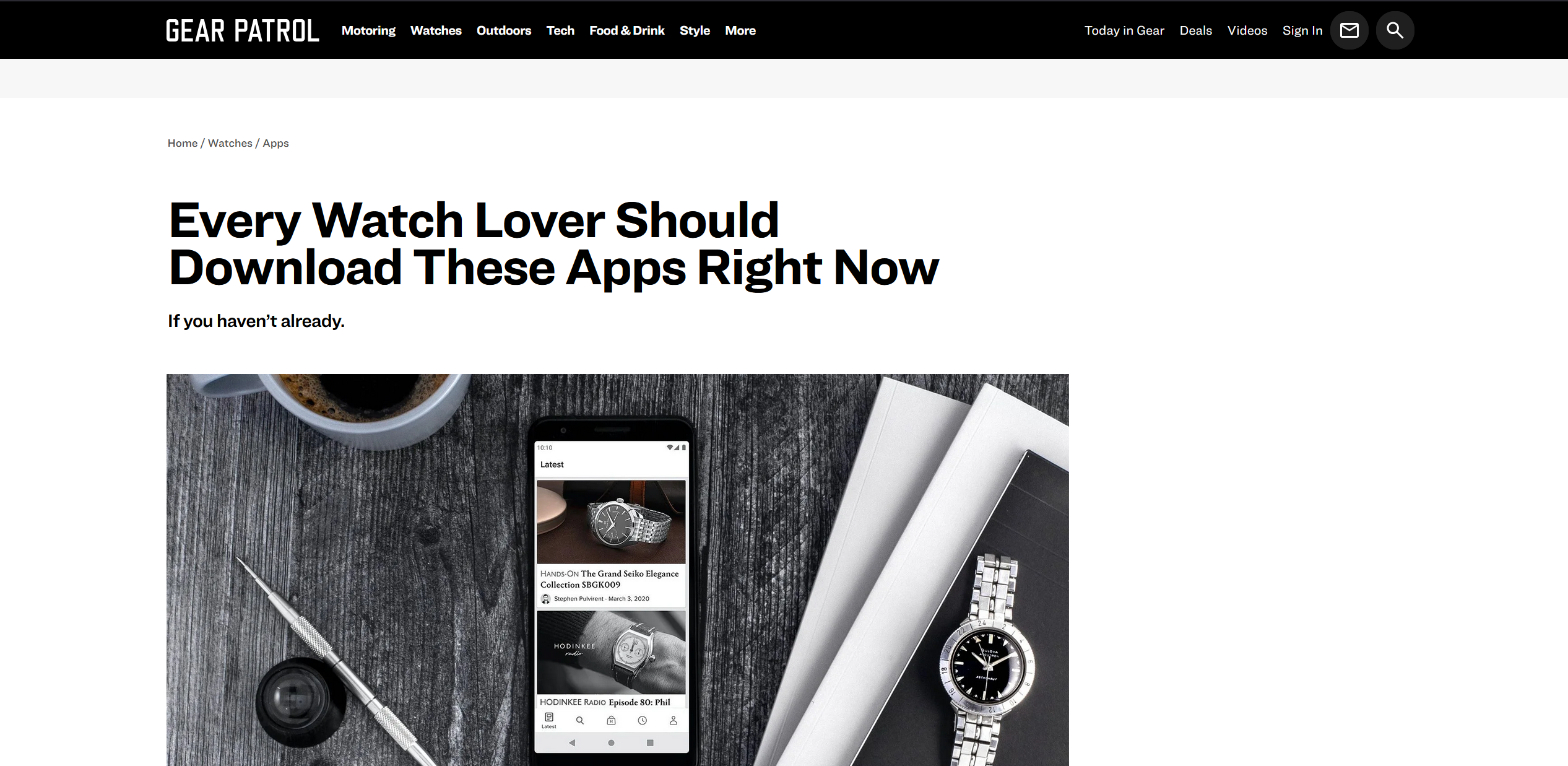
Source: Gear Patrol
Design Process Overview
Crafting a Hub for Watch Enthusiasts
Empathize
I recognized the challenge watch enthusiasts face in staying informed across fragmented sources.
Define
I articulated the need for a centralized, easy-to-use platform for comprehensive watch information.
Ideate
I explored existing watch platforms for inspiration and created initial sitemaps and wireframes.
Prototype
I refined wireframes with colors and interactions, focusing on familiar watch industry design language.
Testing
I conducted testing with enthusiasts to ensure intuitiveness and usefulness.
Emphatize & Define
Mapping the User Landscape
As a watch enthusiast, I understand the frustration of scattered information across various websites, blogs, and social media. Staying truly informed requires significant effort on my part and that of others. In this phase, I considered the core needs of fellow enthusiasts: wanting immediate updates on new releases, engaging with watch-related stories, and staying current with industry news – all within an intuitive mobile experience. By understanding these needs and observing the current fragmented landscape, I defined the core problem: the inefficiency of accessing comprehensive watch information.
Which leads to a question...
How might we design an all-in-one mobile app delivering timely, comprehensive watch industry information via a simple, intuitive interface, using familiar design patterns to engage enthusiasts like ourselves?
Ideate
Drawing Inspirations
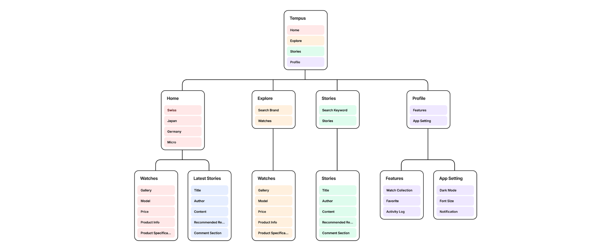
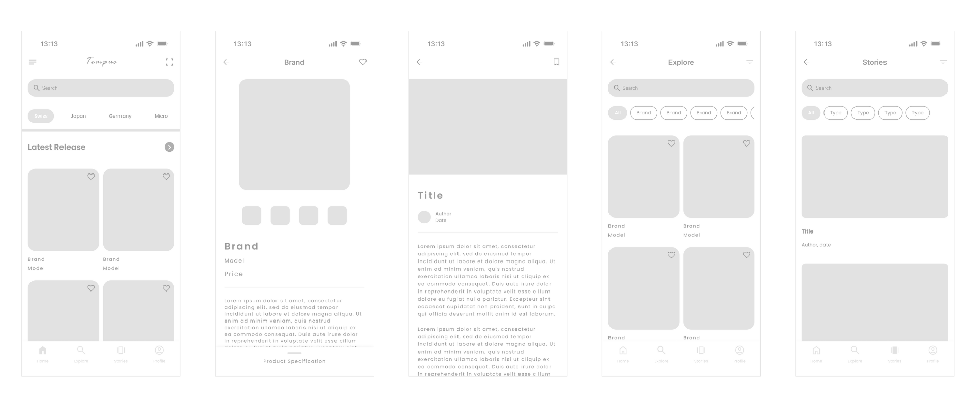
In the ideation phase, I explored existing watch websites and apps to gather inspiration for design elements and UI patterns common in the watch enthusiast community. Following this, I created a partial sitemap to define the app’s information architecture and ensure intuitive navigation between different content categories (latest releases, stories, news, community). Finally, I developed low-fidelity wireframes to visualize the basic layout of key screens and user flows.
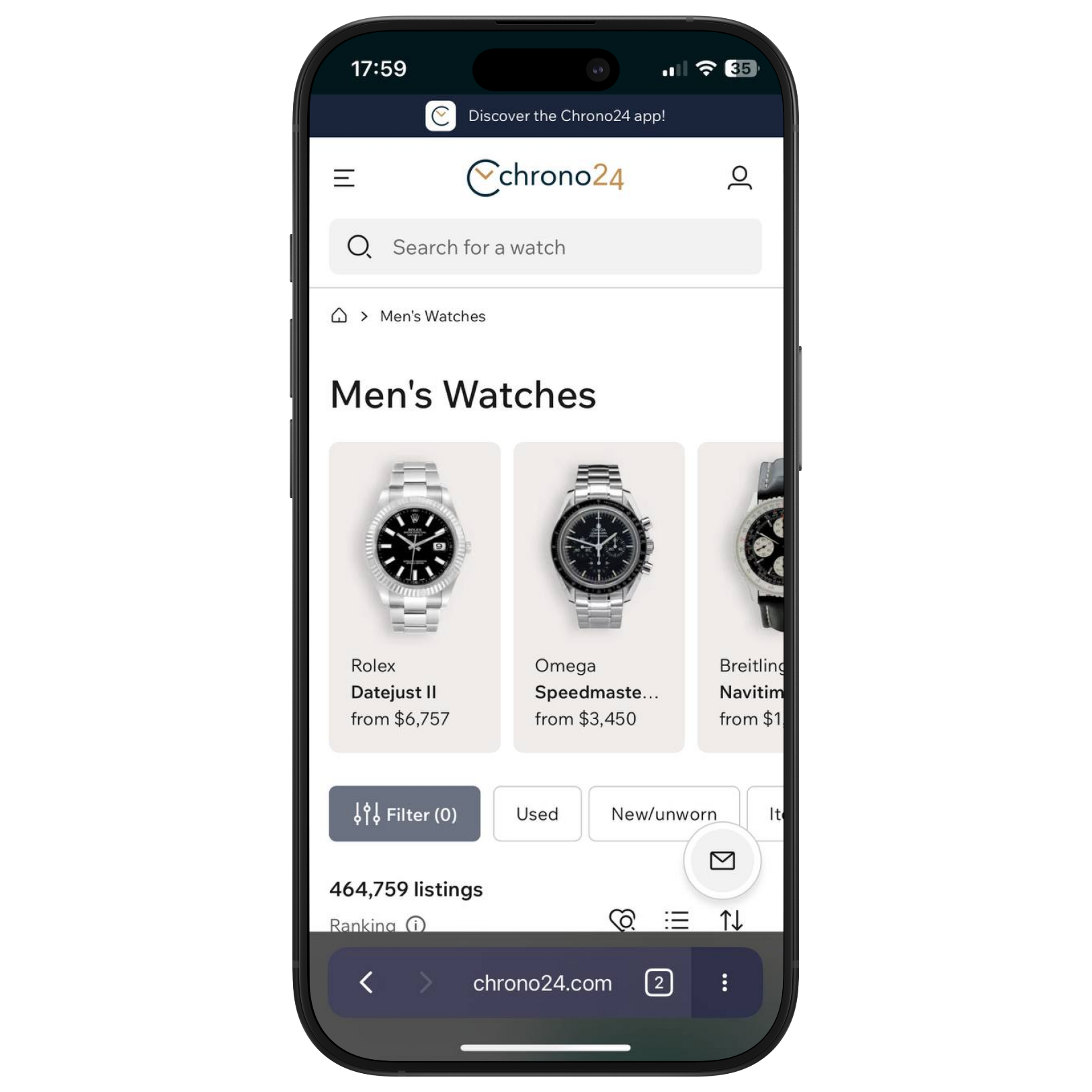
Chrono24
Card Design
I was inspired by the use of card designs for displaying individual watches, as seen in platforms like Chrono24.
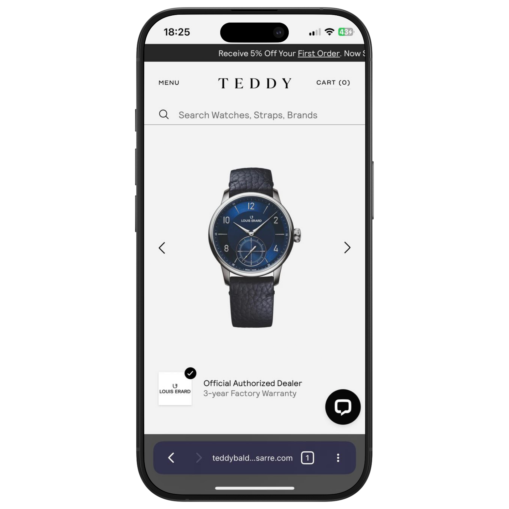
Teddy Baldassare
Watch Image
The use of a prominent watch image as the focal point for a profile page, similar to Teddy Baldassarre’s layout, caught my attention.
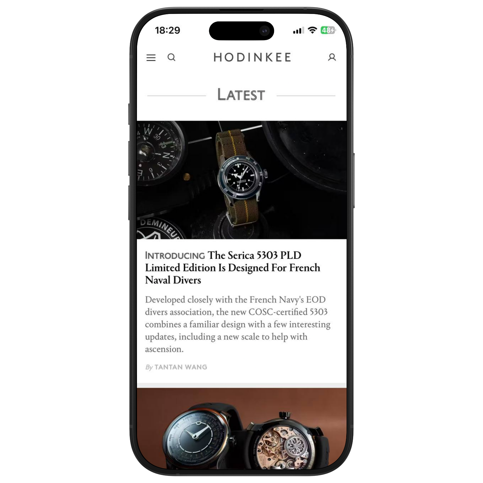
Hodinkee
Blog Layout
I found the layout of watch blogs, such as Hodinkee, to be a useful model for presenting articles and news.
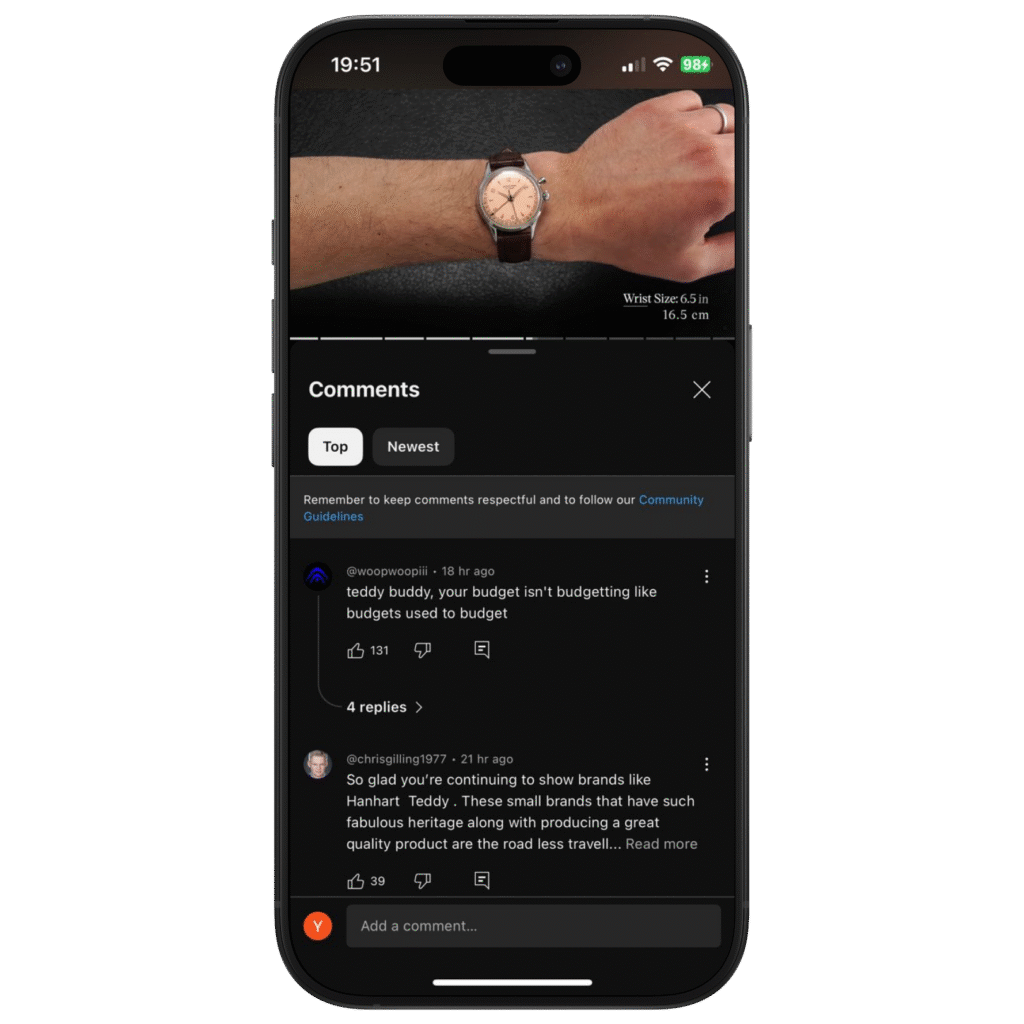
Youtube
Comment Sections
The common structure of comment sections on various platforms provided a familiar pattern for user interaction.
Structuring the Core Experience
Following the inspiration gathering, I focused on establishing the app’s foundational structure. I created a partial sitemap to define the app’s information architecture, ensuring intuitive navigation between different content categories (latest releases, stories, news, community). Finally, I developed low-fidelity wireframes to visualize the basic layout of key screens and user flows, translating the sitemap into initial visual concepts.
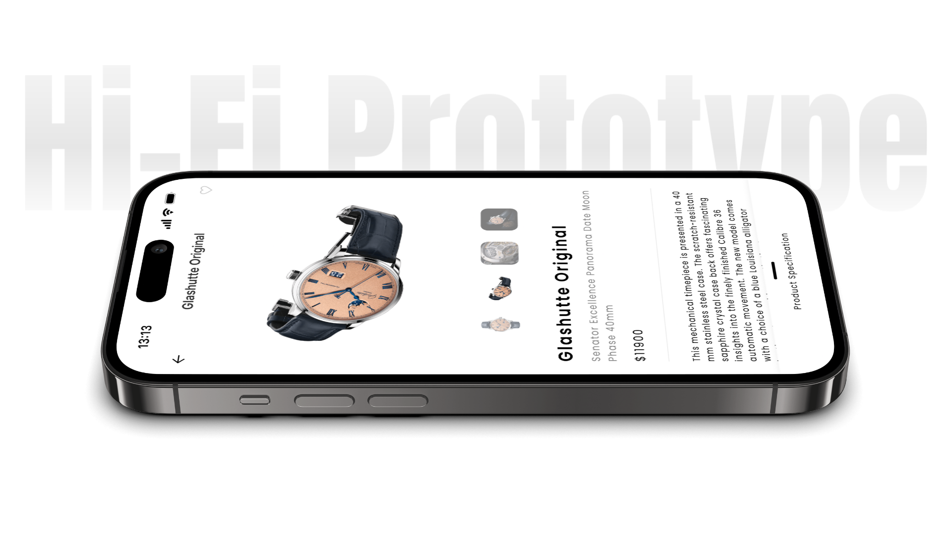
App Showcase
Tempus in Action
The interactive prototype for Tempus provides a tangible feel for the app’s intended user experience. It showcases the visual design, key interactions, and overall flow across the main sections, allowing exploration of how users might navigate and engage with the content.
“I like the country-based homepage, but I’d really appreciate seeing the ‘Top Stories’ more prominently when I open the app, or maybe being able to set my homepage preference.”
“The articles are well-presented, but it would be great to have options to save interesting stories for later or share them with other watch enthusiasts.”
“The ‘Explore’ page already has brand filters, which is good. But it would be even better if I could filter by other things too, like watch type, features, or price range. That would help me find what I’m looking for even faster.”
What I Took Away
Working on Tempus taught me the challenge of building a dedicated hub for a niche community. It highlighted how to consolidate diverse information, like releases and stories, and make it easily navigable so users can stay informed without feeling overwhelmed.
")