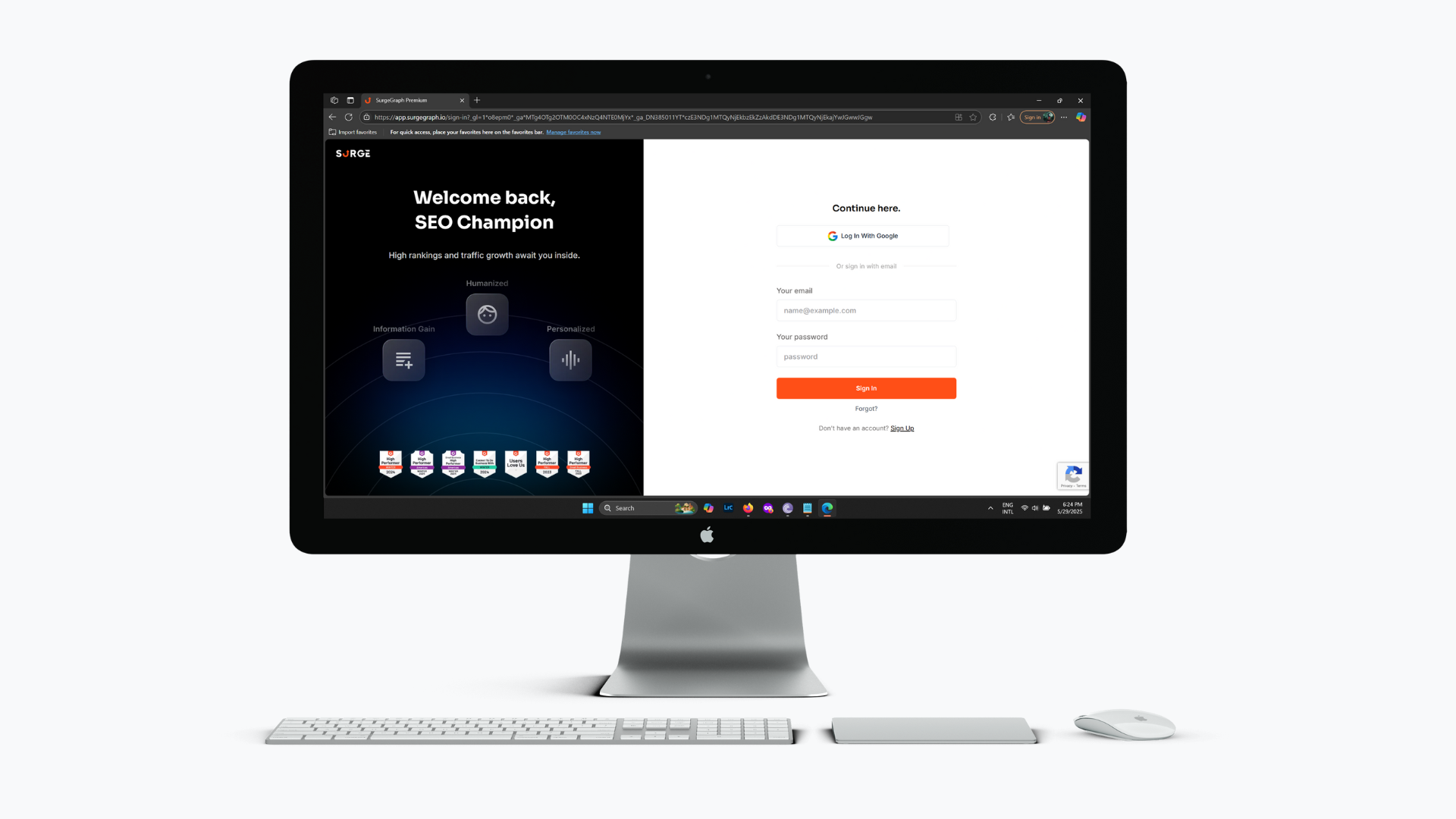
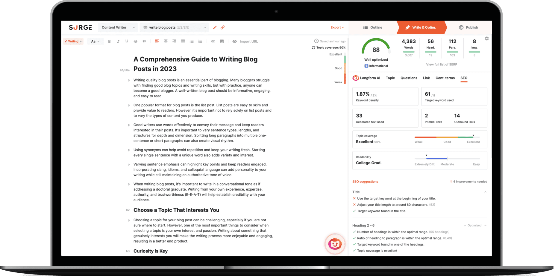
SurgeGraph is an in-house SAAS software I worked on during my time at my previous company, an AI-powered SEO content writer tool designed to help users grow organic traffic. My role involved revamping its existing User Interface, with a major purpose to streamline the entire process from document creation to final export into a single, seamless step, compared to the previous UI which required a more fragmented, step-by-step approach.
Problem Statement
Elevating the User Experience
As an existing product, SurgeGraph’s powerful AI capabilities were central to its value. However, the existing UI, while functional, presented opportunities for minimalization and improvement in overall user experience. The challenge was to transform the interface into a more streamlined platform that matched the sophistication of its variety of useful features, specifically by making the complex workflow from document creation to final export feel like a single, seamless step, contrasting the previous disjointed, step-by-step approach.
Design Process Overview
Navigating the Redesign Journey
Empathize
I analyzed the current SurgeGraph interface, identifying areas where aesthetics, consistency, and interaction clarity could be significantly improved.
Define
I articulated clear objectives for the UI revamp, focusing on minimalistic visuals, streamlining workflows, and improving overall user engagement.
Ideate
I explored various visual and interaction solutions (other SEO tools) to meet these goals, making choices on layouts, components, and user flows.
Prototype
I translated these design decisions into high-fidelity mockups and collaborated closely with developers during the implementation phase.
Testing
I participated in internal reviews and staging bservations to identify further refinements for the live product.
Emphatize & Define
Shaping the Revamp Goals
My empathy phase for SurgeGraph began after I was tasked with the UI revamp. The company’s goal was clear: integrate the writing process more seamlessly and create a modern UI. From that direction, I started my empathy work, examining the existing interface for visual inconsistencies and observing how certain features felt to use. This deep dive directly informed the defined revamp goals: simplifying complex workflows and enhancing overall user efficiency.
Ideate
In the ideation phase, I focused on translating the defined UI challenges into actionable design solutions for the SurgeGraph revamp. I took reference from other SEO tools, paying close attention to their UI and how they designed similar features. My goal was to create a visual language and interaction patterns that felt intuitive and modern, specifically for a seamless document creation-to-export flow. Due to company restrictions, I do not have files for wireframes, sketches, or other relevant design explorations from this phase.
App Showcase
SurgeGraph Vertex in Action
This section presents two video tutorials showcasing the redesigned User Interface of SurgeGraph, which comes with its rebrand as SurgeGraph Vertex. The following video will be a demonstration of the new UI, its streamlined flows, and some specific features I worked on. Please note that the latest live design of SurgeGraph may differ, as my contributions were implemented approximately 8 months ago.
What I Took Away
Working on SurgeGraph Vertex was a valuable learning experience in redesigning a live product. It showed me the challenge of modernizing its UI while ensuring seamlessness, particularly in streamlining the content creation process. This project reinforced how important clear communication is when collaborating with developers to bring design ideas to life.