MyPB 2.0 is a concept project I’ve undertaken to revise the design of an existing mobile banking app, specifically focusing on Malaysia’s Public Bank mobile app (MyPB). As a user myself, I felt that the current User Interface lacked a personal touch and overall seamlessness. My goal with MyPB 2.0 is to envision and design a banking experience that feels more personal, aesthetically refined, and straightforward, transforming everyday transactions into an intuitive and engaging interaction.
Figma
2 Weeks
Mobile App
UX Designer
MyPB Users
Problem Statement
The Quest for Personal & Seamless Design
Through personal use of the current MyPB mobile banking app, I’ve observed that while functional, its overall aesthetic can feel dated and impersonal. The design often lacks the straightforwardness and visual cohesion that fosters a truly seamless experience. This can lead to a less engaging and intuitive interaction for users managing their daily finances. MyPB 2.0 addresses these pain points by proposing a comprehensive redesign that prioritizes a modern aesthetic, intuitive interactions, and a more personal connection with the user.
Source: Apple App Store
Design Process Overview
Navigating the Redesign Journey
Empathize
I immersed myself in the existing MyPB app, noting specific pain points related to its aesthetic, overall seamlessness, and personal feel.
Define
I pinpointed the core design challenges in the current interface, articulating clear objectives for creating a more personal, straightforward, and visually seamless experience.
Ideate
I explored various design solutions to refresh the overall UI and refine interactions, sketching out concepts for a more engaging and intuitive aesthetic.
Prototype
I built interactive prototypes to visualize and test these redesigned flows and visual elements, ensuring clarity, straightforwardness, and a seamless user experience.
Testing
I conducted usability testing to gather feedback on the aesthetic appeal, intuitiveness, and overall personal feel of the redesigned experience compared to the original.
Emphatize & Define
Dissecting the Current Digital Banking Experience
My empathy phase involved a dive into the existing MyPB app’s interface. As a user, I examined its visual elements and interactions, particularly focusing on the money transfer flow. This firsthand exploration helped me define core design challenges, from outdated aesthetic to interactions that felt less straightforward than they could be, impacting the user’s overall connection with their banking app. While many interfaces presented refinement opportunities, I chose to showcase only a few key screens that need immediate attention.
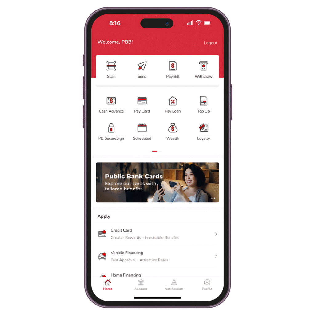
Home Page
Impersonal Aesthetic
The current interface often feels uninspired and lacks the modern, personal touches that foster engagement and user comfort in daily banking.
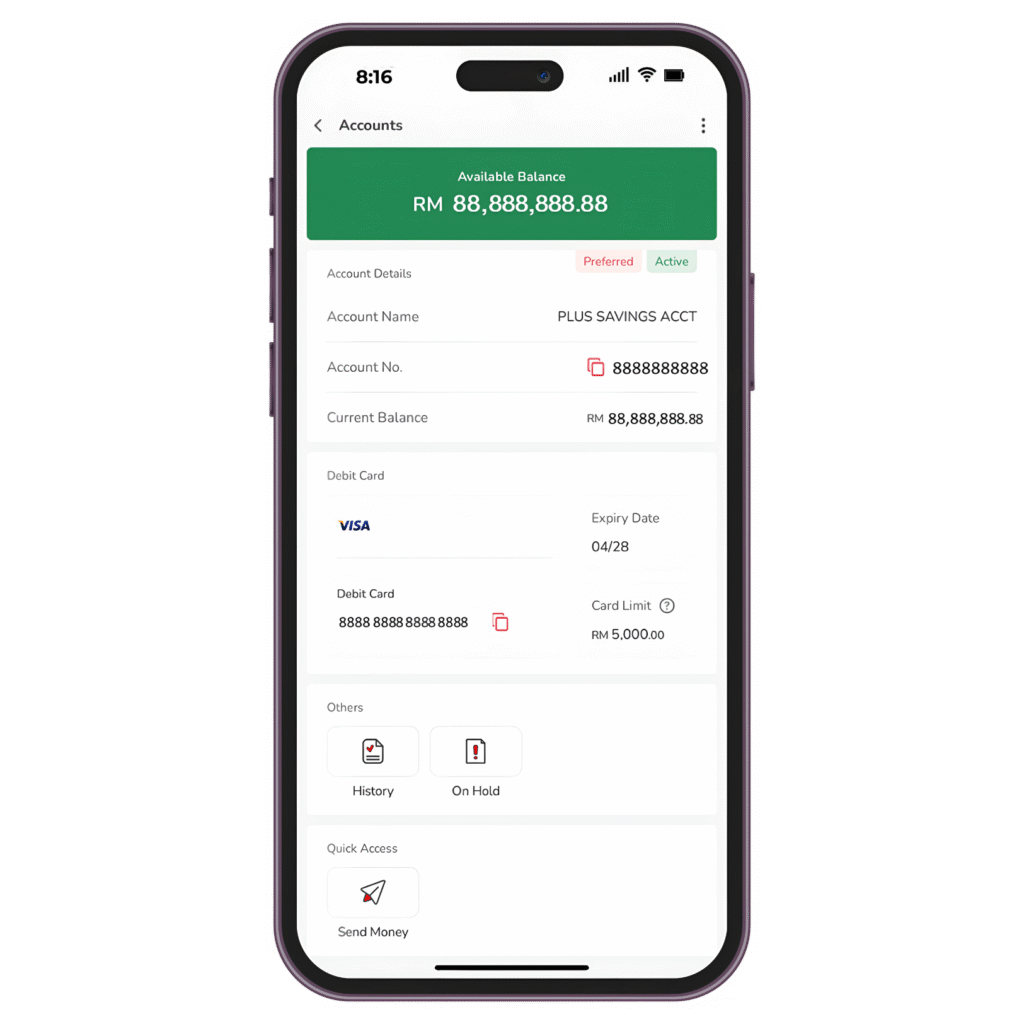
Account Page
Flat Hierarchy
The financial details are presented in a very “mundane” way, without a clear visual hierarchy to make key information stand out effectively.
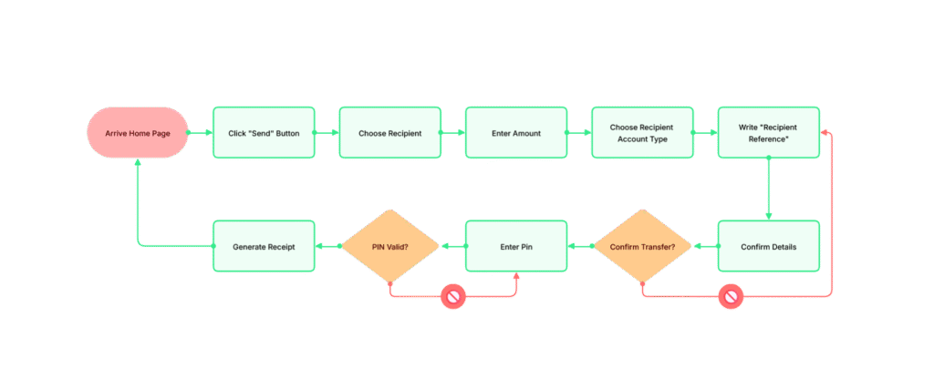
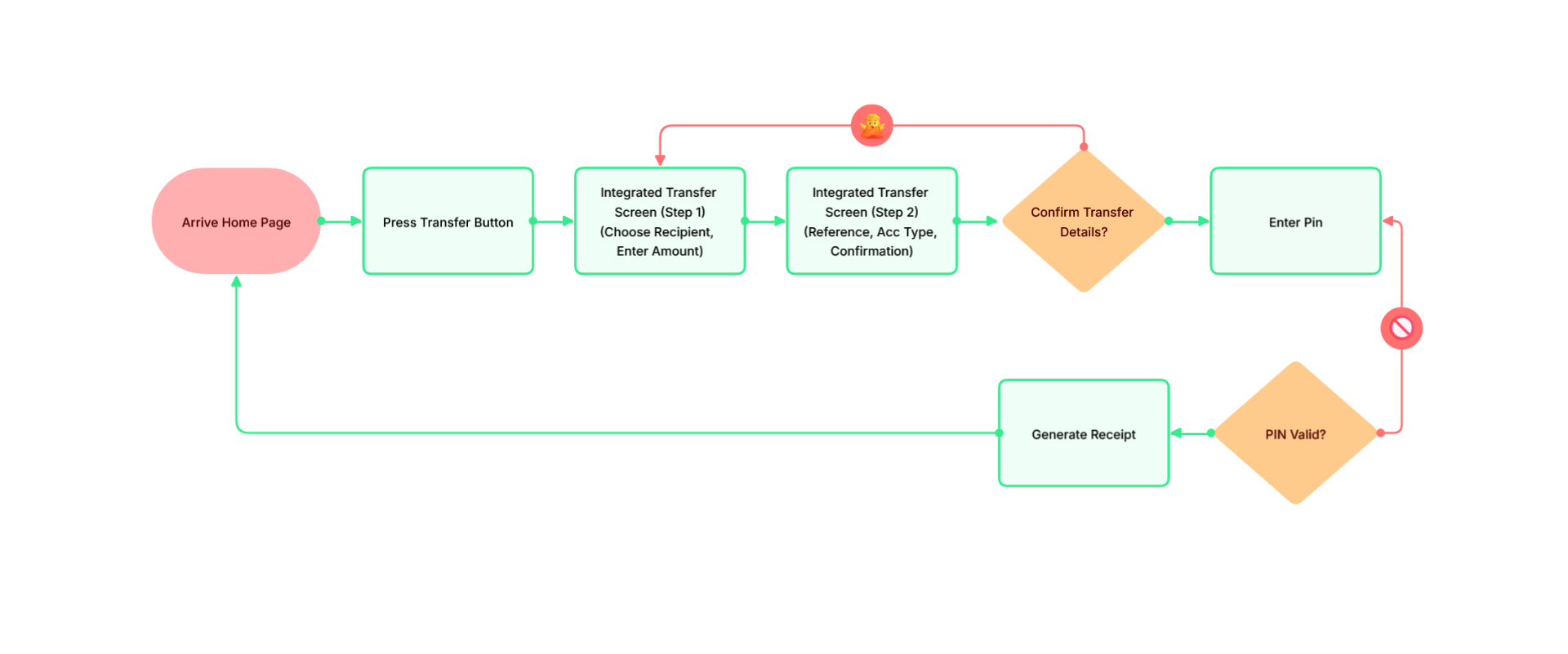
Current User Flow Map
Loose Experience
The money transfer user flow often feels like a series of discrete steps, with each action occurring on a separate screen or component. While this approach might be well-intended to reduce cognitive load at each individual step, I personally feel a more integrated and compact design could achieve greater seamlessness without overwhelming the user.
Which leads to a question...
How might we redesign the MyPB mobile banking app to create a more personal, aesthetically refined, and straightforward user experience, enhancing intuitiveness and user confidence in their daily banking tasks?
Ideate
Charting a Course for Personal & Seamless Design
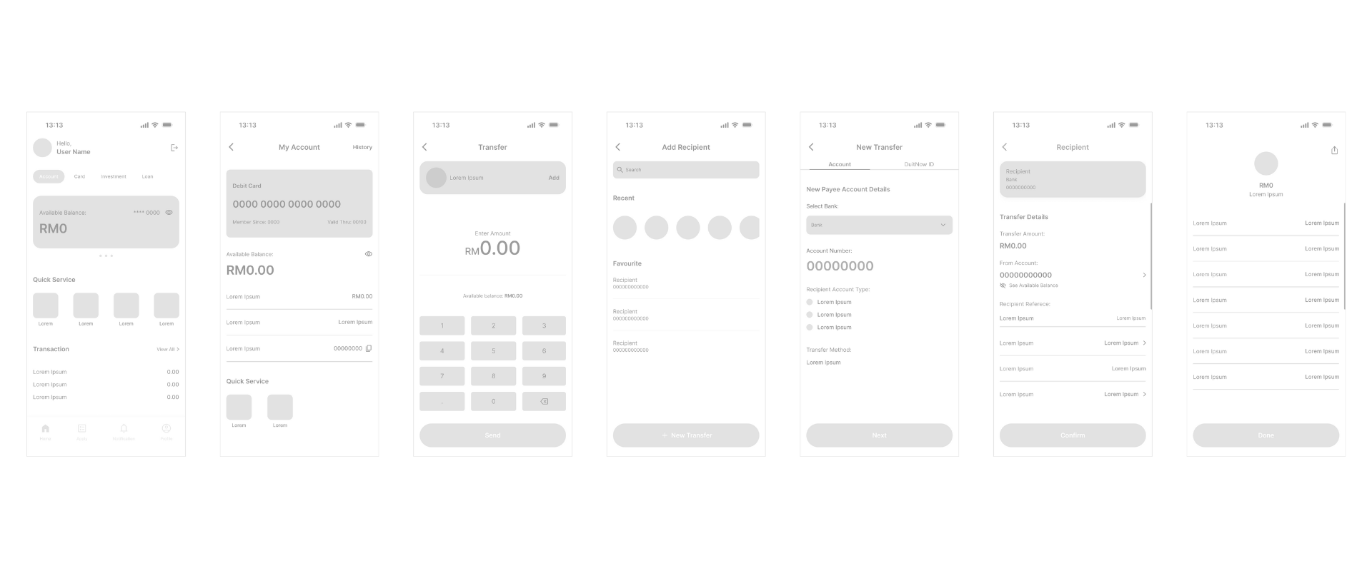
In the ideation phase, I focused on translating the defined design problems into actionable solutions, with particular emphasis on optimizing the money transfer flow. My primary goal was to create a visual language and interaction patterns that felt both personal and straightforward. I explored various approaches to refresh the UI and simplify interactions, sketching concepts for a more aesthetically refined and seamless experience. This involved developing user flow map and initial wireframes to visualize key redesigned layouts for this critical process.
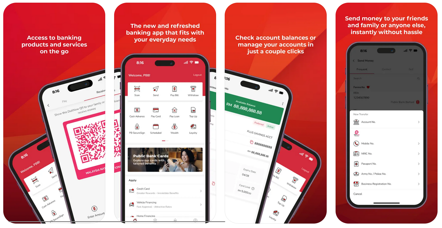
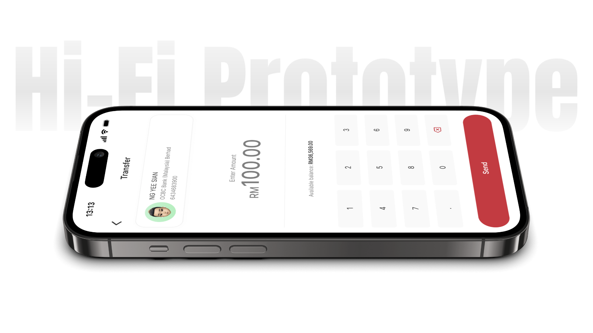
App Showcase
MyPB 2.0 in Action
The interactive prototype for MyPB 2.0 provides a tangible feel for the redesigned user experience. It showcases the new visual design and streamlined interactions, specifically focusing on the money transfer flow. I invite you to explore it and experience the refined aesthetic of MyPB 2.0 and try the seamless transfer process for yourself.
“While the transfer flow is great, I’d be interested to see how other common banking tasks, like viewing statements or managing recurring payments, could also get this same simplified and personalized treatment across the app.”
“The streamlined money transfer process is clearly more efficient. However, for recurring transfers or sending to someone not in my recent list, I’d be interested in exploring if there could be even quicker access to those specific options within the flow itself.”
“While the app’s new aesthetic is a significant step forward, I wonder how this modern and personal feel could be consistently applied to less frequently used sections of the app, ensuring a cohesive experience throughout.”
What I Took Away
Working on MyPB 2.0 showed me how to approach redesigning an exiting app, specifically tackling usability and aesthetic problems within its interface and flows. This project truly highlighted for me the crucial role of refined design and straightforward interaction patterns in building user confidence, reinforcing that achieving seamlessness is key to a truly enhanced experience.
")