BeSaved is an expense tracker I designed with the idea of making financial tools feel less like a chore and more intuitive. It’s built for people who want to be mindful of their spending, offering a straightforward and clear way to log daily expenses. The design focuses on simplicity, aiming to make budgeting feel more approachable and efficient.
Figma
3 months
Mobile App
UX Designer
19–60 years old
Problem Statement
Exploring a design alternative
Using different expense trackers myself, I often felt like they could be simpler and more user-friendly. BeSaved is my personal exploration of what an expense tracker could be – something that feels effortless to use and gets straight to the point. The focus is on keeping things minimal and functional to make tracking expenses feel less overwhelming.
Source: Google Playstore
Design Process Overview
Laying Down the Design Roadmap
Empathize
I analyzed my own experiences with expense trackers, pinpointing frustrations and areas needing simplification for clarity.
Define
I identified key usability issues in existing apps, focusing on the need for a more straightforward expense tracking experience.
Ideate
I sketched user flows and interface layouts, prioritizing simplicity and ease of understanding for core actions.
Prototype
I created interactive Figma prototypes with visuals and interactions to test design feasibility.
Testing
I shared prototypes to get feedback on usability and identify areas for refinement in the interface and flows.
Emphatize & Define
Navigating the Landscape of Current Solutions
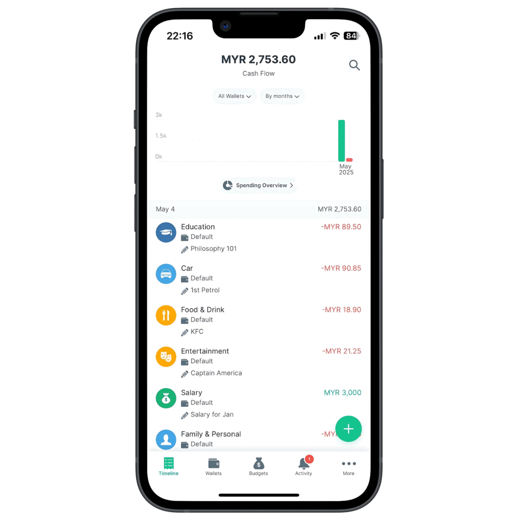
To understand the common user experiences and potential pain points in existing expense tracker apps, I analyzed several popular options. By putting myself in the shoes of a user, I observed areas where the flow felt cumbersome, information was unclear, or the interface was distracting. These observations formed the foundation for defining the specific usability challenges BeSaved aims to address.
Spendee
Scattered Glance
Sometimes the layout felt a bit busy, and the main graph could be distracting if you just wanted to quickly scan your spending.
Cashew
Fractured Flow
Adding transactions felt less direct. Instead of showing a full “add” page for upfront customization, it showed multiple pop-ups.
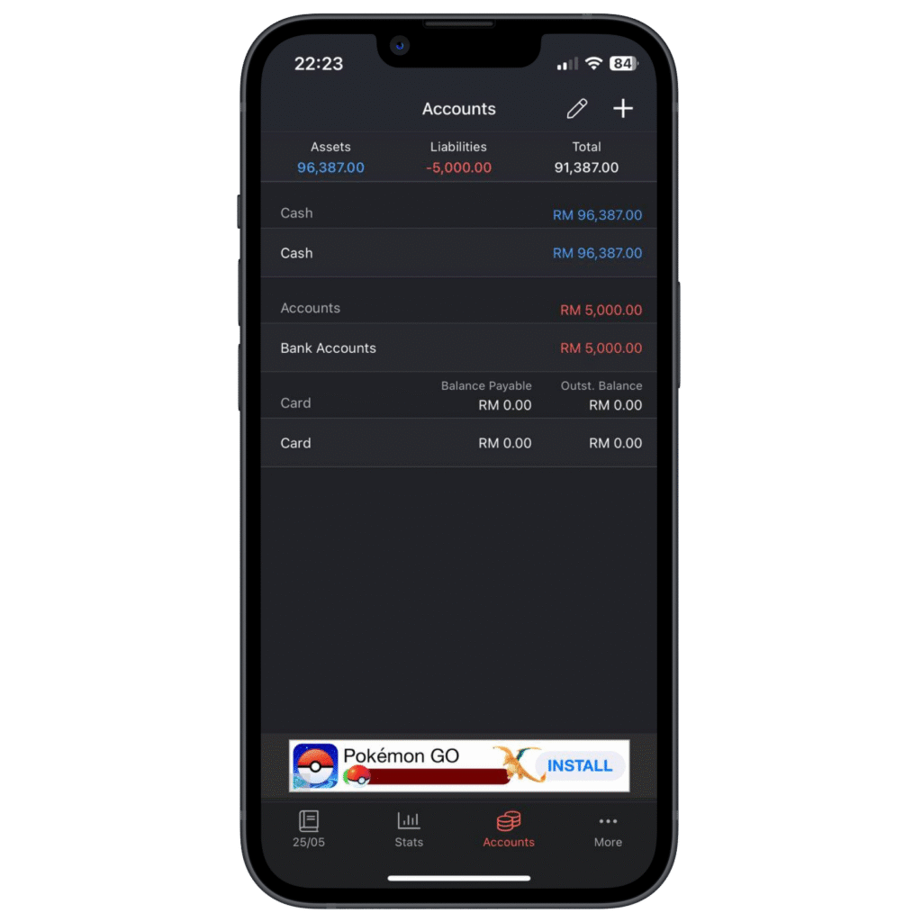
Money Manager
Flat Hierarchy
It could be easier to quickly read information if there was a bit more contrast and a clearer way to see what was important.
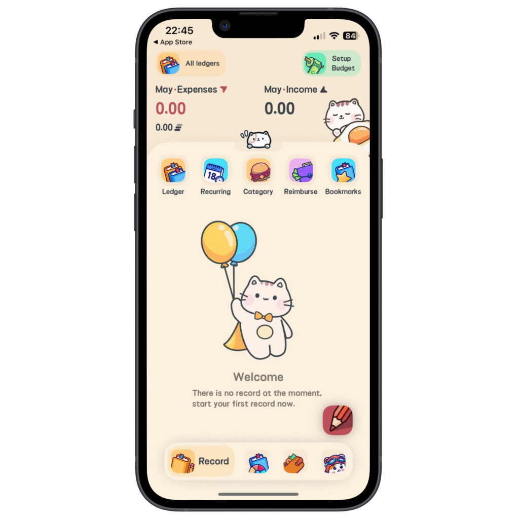
Meow Manager
Playful Overload
While the playful visuals were nice, they sometimes felt like they added extra visual noise that could slow things down.
Which leads to a question...
How might we create an expense tracking app that feels visually clearer and flows more smoothly for users, while still offering all the essential features they expect?
Ideate
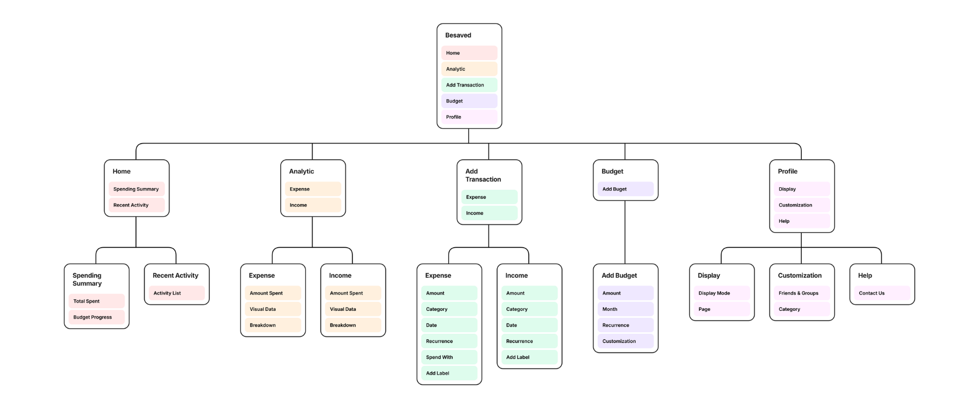
From Concepts to Flows
I identified the main things people do with an expense tracker – adding transactions, setting budgets, looking at their spending, and managing their profile. For BeSaved, I wanted to make these actions as clear and straightforward as possible. I sketched out how users would move through these tasks, always keeping a simple and clean design in mind.
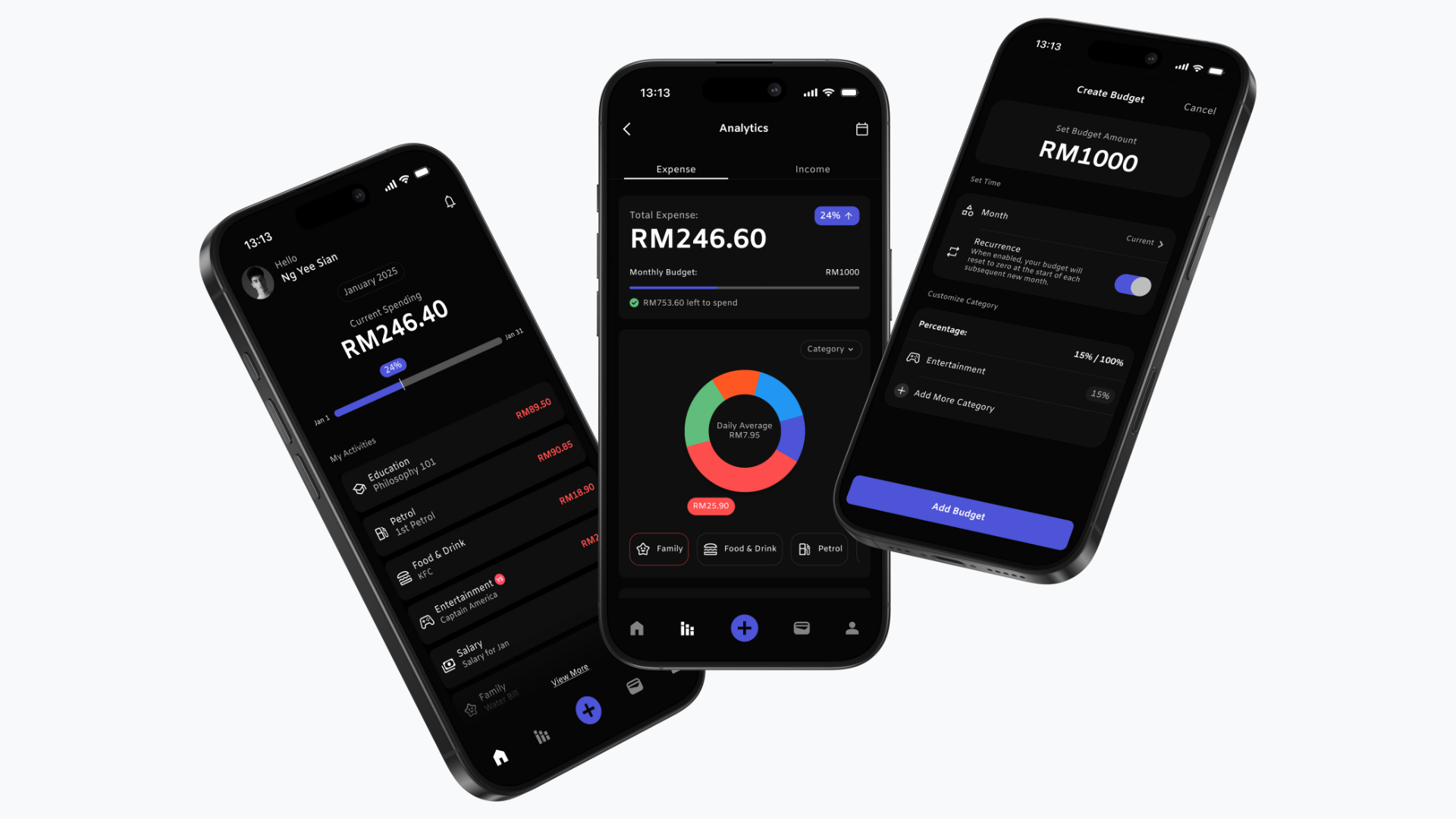
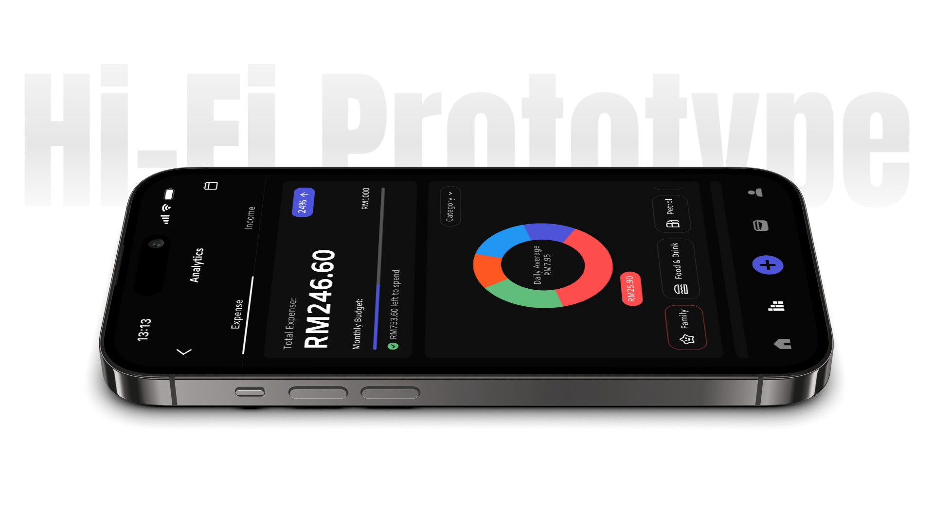
App Showcase
Besaved in Action
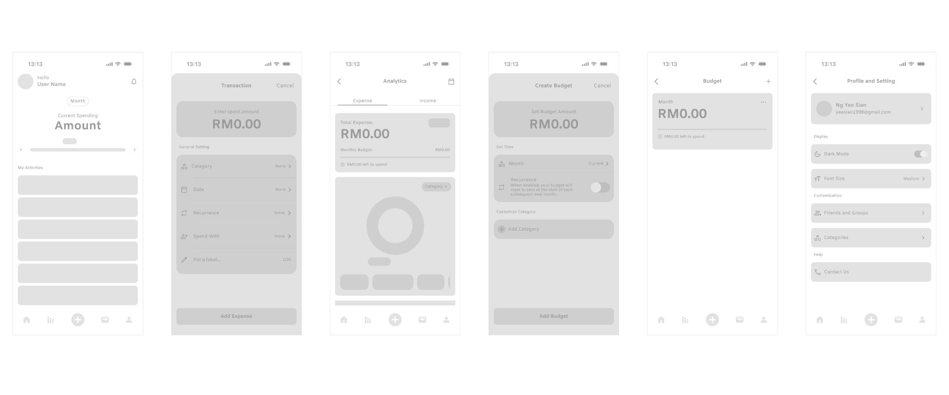
You can explore the interactive prototype of BeSaved here. Flows 1-7 focus on adding expenses with a few smaller features mixed in, and flow 8 shows some additional functionalities.
Instead of just saying “View More,” it would be clearer to use a more specific label and maybe add a little animation to show that you can expand a section.
After saving an expense, a quick confirmation like “Expense Added!” would be helpful, maybe with a little list of recent entries on the same screen for a quick check.
The label “Recurrence” could be clearer, maybe something like “Reset Monthly?” with a little explanation for options that might not be obvious.
What I Took Away
Working on BeSaved taught me that minimalism in design isn't just about how something looks, it's really about making it clear and functional. The process helped me understand how important things like visual hierarchy and user flow are in creating an experience that feels seamless and easy to use, even with small changes.